|
written by Instructional Coach Andrew Ellingsen & Collaborative Teacher Shannon Horton For the last month, we've been working with a couple of teachers on building a media literacy infographic. It has been shared with staff and students in our district, and the feedback has been really positive. (Click on the image below to open a full-size PDF that can be downloaded.) 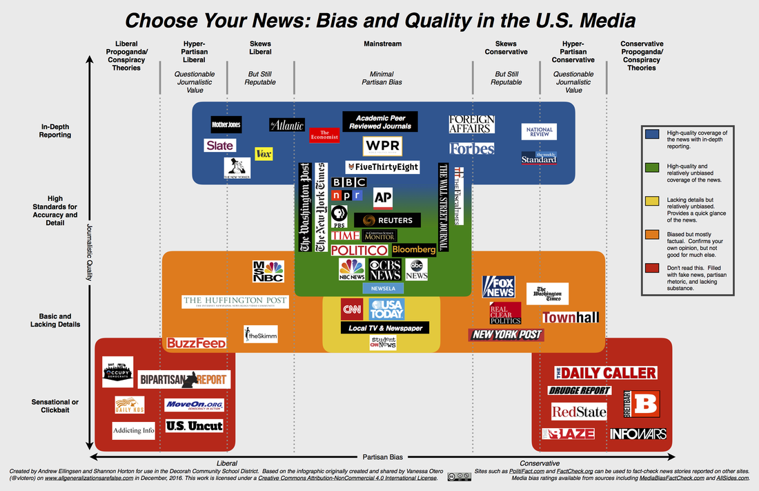 Why we made it Our goal in creating this infographic was to give students a tool to use to help them sort media outlets in two ways -- the liberal/conservative bias of the organization and the level of depth in reporting. It is not intended as a way to replace critical thinking and thoughtful analysis, and we've been really pleased to see that the students who have been using it in the past couple weeks have been having thoughtful conversations and discussions. The idea to focus on media literacy to help students identify quality reporting and inherent bias in the media isn't new to our district -- this is something many teachers have been covering in their classrooms for years. With all the buzz on both ends of the political spectrum about "fake news" right now, though, it made sense to us when two DHS teachers approached us about partnering on a media literacy project. How we made it Following our initial meeting with them, we began gathering resources that might be helpful. In that research, we came across an early draft of an infographic created by Vanessa Otero. We really liked the idea of sorting news organizations in two ways at once, but it left out some of the news sources our students use and some of the category descriptors were more blunt than we would choose for middle and high school students. We re-created the x-y axis plot and used her axis labels of "Quality" and "Bias" but chose to use colors instead of ovals as our visual organizer. As we sorted the news organizations, we used Vanessa Otero's initial placements as our starting place. She described her methodology in an extensive blog post, and we felt good about the level of analysis she did as she placed them. In addition to her initial placements, though, we also turned to sites like www.mediabiasfactcheck.com and www.allsides.com to get more guidance on the placement of media outlets. We liked that www.mediabiasfactcheck.com is run by an individual person who analyzes the news organizations on a host of characteristics and that www.allsides.com uses public perceptions of the media outlets along with a methodology for calculating bias. This counterpoint between a research method and crowd-sourced rankings struck a nice balance, and in nearly all cases, both sites had media outlets ranked identically or very similarly. How we revised it As we worked on this, we tried to be careful not to let our own bias influence where we placed things on the infographic. To help with that, we shared a draft with colleagues and friends on both sides of the political spectrum for feedback and made adjustments accordingly. This was a helpful step in the process as we received several high quality news source recommendations that we had not included in our initial draft. It was at this point that we shared a draft of the infographic with DMS and DHS teachers for feedback. Their response was thoughtful and helpful -- their questions, recommendations, and additional resources helped us make further refinements to the placements of the news organizations. How it’s being used There are currently more than thirty DMS and DHS teachers who have requested poster-sized copies of the infographic to use in their classrooms. We've received requests to share it with teachers and librarians outside our district, and we are happy to pass it on to anyone who finds it helpful! Use, share, debate, and edit it -- and continue to seek out high quality news sources for use with students. Our goal in creating and sharing this is certainly not to favor one political perspective, but rather to help our students become better informed citizens by using the best possible sources of information.
4 Comments
Sarah Zbornik
3/2/2017 05:57:17 am
This is such a useful tool! Thank you for your thoughtful work on this. My 15 year old has already referenced it at home. Are we able to share with others outside the school district?
Andrew Ellingsen
3/2/2017 10:53:53 am
By all means -- please share away!
Zach Fromm
3/2/2017 06:30:07 am
I think it is a great starting point and springboard into many substantive conversations in a social studies classroom. As news outlets continue to shape themselves, change ownership, etc., I know we will be able to come back to the table as we see leanings shifting one way or another!
Andrew Ellingsen
3/2/2017 10:55:12 am
I agree -- it's an infographic that will remain in constant flux both as current organizations continue to grow and change and as new organizations emerge! Leave a Reply. |
